Skip to content
About
Expertise
Clients
Playground
Contact
Menu
About
Expertise
Clients
Playground
Contact
DESIGN / CODE / MARKETING
CONSULTATION & MANAGEMENT
AVAILABLE FOR FREELANCE
PROJECTS IN APR 2023
[email protected]
(+61) 0411 139 439
Let's Talk
My Playground
Graphic design
April 4, 2018
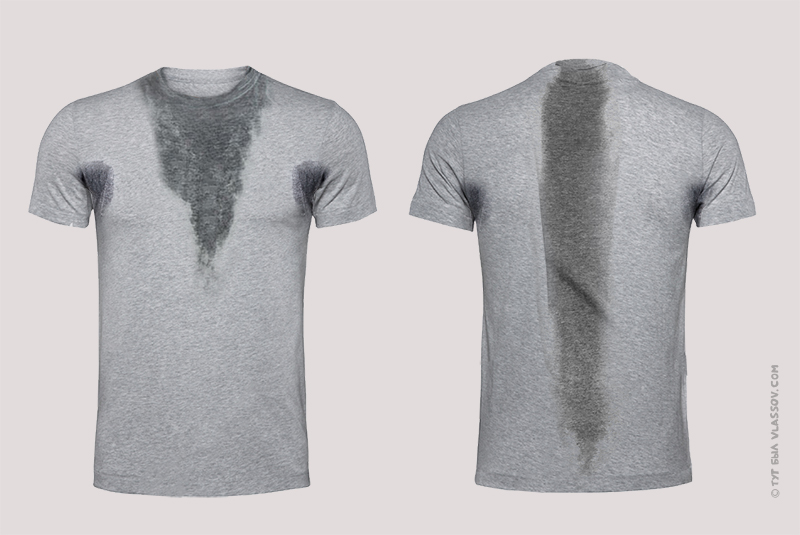
Sweat shirt
Graphic design
February 17, 2016
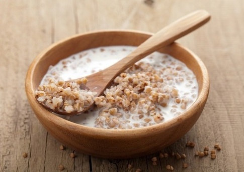
Design porridge, or why white space is important.
Graphic design
December 22, 2015
Я хуею
Advice
October 2, 2015
[Message clipped] View entire message
Random
June 22, 2015
Social behaviour changes
Web design
May 26, 2015
Website loading slow
Random
April 23, 2015
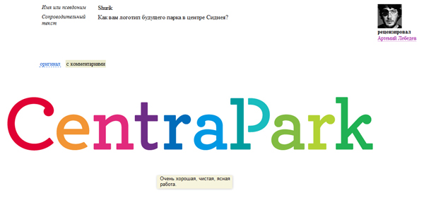
What do Sydney and Vladivostok have in common?
Graphic design
April 17, 2015
Logo ideas while you drive
Graphic design
April 16, 2015
A 10-minute photoshoot
Random
April 13, 2015
What does Rockdale council and Italy have in common?
Advice
April 10, 2015
Free chat support from Apple
Random
March 27, 2015
Simple diagrams
Load More
Graphic design
April 4, 2018
Sweat shirt
Graphic design
February 17, 2016
Design porridge, or why white space is important.
Graphic design
December 22, 2015
Я хуею
Advice
October 2, 2015
[Message clipped] View entire message
Random
June 22, 2015
Social behaviour changes
Web design
May 26, 2015
Website loading slow
Random
April 23, 2015
What do Sydney and Vladivostok have in common?
Graphic design
April 17, 2015
Logo ideas while you drive
Graphic design
April 16, 2015
A 10-minute photoshoot
Random
April 13, 2015
What does Rockdale council and Italy have in common?
Advice
April 10, 2015
Free chat support from Apple
Random
March 27, 2015
Simple diagrams
Random
December 18, 2014
Some dessert, Mexican style
Random
April 7, 2014
Always blame the printers
Uncategorized
December 18, 2013
Icon shortage
Uncategorized
October 28, 2013
Personalised emails
Uncategorized
July 22, 2013
What do Herman Miller, Motorola and Hilton have in common?
Uncategorized
July 13, 2013
Government Easy Pay
Uncategorized
June 12, 2013
Free education for everyone, everywhere.
Uncategorized
June 5, 2013
Foot or Food?
Uncategorized
May 8, 2013
Full of agIdeas
Random
April 26, 2013
Cities embracing design
Random
April 25, 2013
Catching up
Uncategorized
April 9, 2013
Design in Russia, apparently it exists
Graphic design
March 7, 2013
One night stand
Random
January 8, 2013
The photoshoot didn’t work out
Uncategorized
November 23, 2012
Dating online
Random
November 22, 2012
Traditional technology
Uncategorized
September 14, 2012
Useless electrical appliances
Uncategorized
July 15, 2012
People in power
Random
June 25, 2012
Organising
Graphic design
May 23, 2012
Beams Arts Festival — final presentation
Uncategorized
January 20, 2012
Бизнес-линч
Uncategorized
September 30, 2011
Barbed wire VS syringe fence
Uncategorized
June 15, 2011
Baby on board
Uncategorized
May 29, 2011
The scent of Sydney (installation)
Uncategorized
May 13, 2011
Aging nature
Uncategorized
April 18, 2011
Даже так
Uncategorized
April 10, 2011
***** на природе
Uncategorized
April 8, 2011
…we are sad to announce that we will be closing down.
Uncategorized
March 2, 2011
Fish pond in your cup of tea
Uncategorized
March 1, 2011
—
Uncategorized
January 23, 2011
Sydney trains
Graphic design
January 10, 2011
Eastside Learning Centre
Uncategorized
January 3, 2011
Coles, no no
Uncategorized
December 21, 2010
Cheers! (2)
Uncategorized
December 9, 2010
This work (not mine) hung in UTS at some point
Uncategorized
November 11, 2010
The upside down heart
Uncategorized
November 6, 2010
Было-бы так везде
Uncategorized
November 4, 2010
Goodbye America
Uncategorized
November 3, 2010
Google (mis)presentations
Graphic design
October 25, 2010
ISA—RC24
Uncategorized
July 14, 2010
Новая мода
Uncategorized
July 13, 2010
Intelligent software
Uncategorized
June 29, 2010
Period pain
Uncategorized
June 16, 2010
Они немного охуели…
Uncategorized
June 16, 2010
See attached
Uncategorized
June 15, 2010
Copyright © 1999-2010 LiveJournal, Inc. All rights reserved.
Uncategorized
May 31, 2010
Door locks
Uncategorized
May 27, 2010
back to school
Uncategorized
May 26, 2010
Makeup by Alla
Uncategorized
May 25, 2010
Только заметил
Uncategorized
May 21, 2010
Loyalty discounts
Uncategorized
April 7, 2010
ATM
Uncategorized
April 7, 2010
Если приспичило
Uncategorized
April 1, 2010
April fool’s day (mass-fooling)
Uncategorized
March 24, 2010
Russian GPS
Uncategorized
March 18, 2010
A translation would be nice
Uncategorized
March 11, 2010
Principles of Design: Repetition
Uncategorized
March 5, 2010
Pick your language
Uncategorized
December 18, 2009
Педиэф
Uncategorized
December 3, 2009
Приятного аппетита
Uncategorized
November 18, 2009
History repeats itself
Uncategorized
November 11, 2009
Extreme views
Uncategorized
November 9, 2009
Cheap websites. Contatc Us
Uncategorized
October 16, 2009
Cheers!
Uncategorized
October 15, 2009
Taking a bath?
Uncategorized
October 15, 2009
Another friendly reminder :-)
Uncategorized
October 14, 2009
Target market: послевоенное поколение
Uncategorized
September 25, 2009
Australian domain name
Uncategorized
August 20, 2009
Не надо, я сама.
Uncategorized
August 19, 2009
Ровно год назад…
Uncategorized
August 19, 2009
Ровно год назад…
Uncategorized
August 14, 2009
Big пиздец
Uncategorized
August 13, 2009
Ровно год назад…
Uncategorized
August 11, 2009
Ровно год назад…
Uncategorized
August 11, 2009
Ровно год назад…
Uncategorized
August 4, 2009
Ровно день назад…
Uncategorized
August 4, 2009
Ровно год назад…
Uncategorized
August 4, 2009
Ровно год назад…
Uncategorized
July 31, 2009
Ровно год назад…
Uncategorized
July 25, 2009
Ровно год назад…
Uncategorized
July 21, 2009
Catchall
Uncategorized
July 21, 2009
Ровно год назад…
Uncategorized
July 21, 2009
Ровно год назад…
Uncategorized
July 20, 2009
Ровно год назад…
Uncategorized
July 20, 2009
Ровно год назад…
Uncategorized
July 19, 2009
Ровно год назад…
Random
July 17, 2009
Ровно год назад…
Uncategorized
July 4, 2009
4/07/09
Uncategorized
May 26, 2009
Не расслабишься
Uncategorized
May 25, 2009
(М?) (Ж?)
Uncategorized
May 21, 2009
Обновляемся
Uncategorized
May 7, 2009
I love dark chocolate
Uncategorized
May 5, 2009
Бабло
Uncategorized
May 5, 2009
Всем срать!
Uncategorized
May 3, 2009
Домашние животные.
Uncategorized
May 3, 2009
Забыл поздравить.
Uncategorized
May 1, 2009
Let’s compare — email notifications
Uncategorized
April 29, 2009
Какие нах*й правила?
Uncategorized
April 24, 2009
Russko-Английский
Uncategorized
April 20, 2009
Сельский кайф
Uncategorized
April 16, 2009
Save paper — save environment
Uncategorized
April 15, 2009
Только в кино!
Uncategorized
April 11, 2009
Плохо покрасили
Uncategorized
April 4, 2009
Design & reality
Uncategorized
March 31, 2009
World Cup Qualifier
Uncategorized
March 26, 2009
Ouch ouch ouch ouch ouch
Uncategorized
March 23, 2009
Тема меняется.
Uncategorized
March 17, 2009
Фак ю (fuck you), Russian style
Uncategorized
March 11, 2009
Артемий Лебедев
Uncategorized
February 21, 2009
Back off!
Uncategorized
February 11, 2009
Valentine’s Day
Uncategorized
January 22, 2009
Помойтесь — и вам станет хорошо.
Uncategorized
January 19, 2009
Горский еврей
Uncategorized
January 9, 2009
Flat joke
Uncategorized
January 6, 2009
2**9
Uncategorized
December 18, 2008
Опять одноклассники
Uncategorized
November 24, 2008
Кто кого наебал еще не решено
Uncategorized
September 21, 2008
Be polite.
Uncategorized
September 15, 2008
Ненавижу когда люди смешивают природу и туризм.
Uncategorized
September 8, 2008
Ну что-ж, обновим?
Uncategorized
August 21, 2008
Обиженный унитаз
Uncategorized
June 25, 2008
Goodbye Australia
Uncategorized
June 24, 2008
Songs that never get old
Uncategorized
June 16, 2008
Let’s chat
Uncategorized
June 14, 2008
RUS:ENG Toilet sign
Uncategorized
June 11, 2008
Разнообразный взгляд на жизнь
Uncategorized
June 10, 2008
куда стадо — туда и я
Uncategorized
June 10, 2008
Карточные игры – Игра в Дурак
Uncategorized
June 6, 2008
Полный пиздец
Uncategorized
June 4, 2008
Загадка
Uncategorized
June 4, 2008
Выражения и их смысл
Uncategorized
May 14, 2008
Знакомьтесь!
Uncategorized
May 14, 2008
Ненавижу odnoklassniki.ru!
Uncategorized
May 14, 2008
Вирус и бабы
Uncategorized
May 9, 2008
“Кого-то, блять, мне этот ебaльник напоминает”
Uncategorized
May 9, 2008
День Победы!
Uncategorized
May 8, 2008
ну-с, начнём-с
Uncategorized
May 7, 2008
Uncategorized
September 13, 2007